Branding guidelines
Discover Workast's Branding Guidelines: How to Use Our Brand Assets
Workast's Brand Assets
Find the appropriate assets when promoting, mentioning, or referencing Workast's brand. If you have any additional inquiries, send us an email at marketing@workast.com
Workast as a Work Management Platform
When referring to Workast in written or spoken communication, it's essential to describe it accurately and consistently as a "work management platform." This term accurately reflects the platform's core functionality and helps position Workast as a solution for managing tasks, projects, and workflows in a professional setting.
Here are some examples of how to use the term "work management platform" when referring to Workast:
"Workast is a work management platform that helps teams to collaborate more efficiently and stay on top of their tasks and projects."
"With Workast's work management platform, you can easily organize your team's workflow and ensure everyone is on the same page."
"Whether you're working on a small project or managing a large team, Workast's work management platform makes it easy to stay organized and productive."
When using the term "work management platform," it's essential to ensure that it accurately reflects the key features and benefits of the Workast platform. This will help to ensure that potential users clearly understand what the platform does and how it can help them manage their work more effectively.
Brand name usage
"Workast" is the official brand name of our platform and should always be written in the Lato font, bold and in black, with the first letter capitalized and the rest in lowercase.
Examples of correct usage include: "Create a Workast account," "Create a workspace in Workast," "Working on a task in Workast," and "Working on a project in Workast."
The use of "Workast" as a standalone term without any accompanying noun (e.g., "Create a Workast") or as an indefinite article (e.g., "A Workast") is not considered valid and should be avoided.
Using "Workast" consistently as a brand name in all promotional materials, including websites, social media, and any other written or spoken communications, is important.
The Workast Icon

The Workast icon is a critical part of our brand identity and should always be used as provided, without any modifications to its color, size, or proportions.
The icon should always be displayed in its original color, #DD4B4B.
The icon should be used to maintain its clear visibility and legibility without any distortion or alteration of its proportions.
The icon should always be surrounded by sufficient clear space to ensure its visual impact and prevent crowding or overlapping with other elements.
The icon should not be combined with other graphics or elements and should always be used as a standalone element.
The icon should not be rotated or mirrored and should always be displayed upright, facing the correct direction.
Any icon usage that deviates from these guidelines is strictly prohibited without prior written approval from Workast.
Color Palette
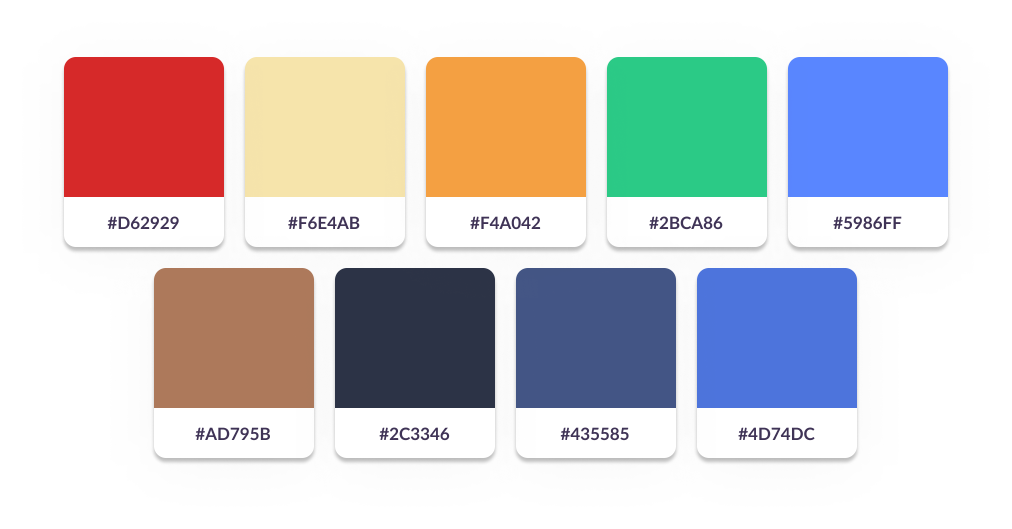
The Workast color palette consists of several primary and secondary colors used consistently across all communication channels.

The primary colors include:
#D62929 (red)
#F6E4AB (light yellow)
#F4A042 (orange)
While the secondary colors include:
#2BCA86 (green)
#5986FF (bright blue)
#AD795B (brown)
#435585 (dark purple)
#2C3346 (dark blue)
#4D74DC (light blue)
These colors should be used consistently across all Workast promotional materials to maintain consistency in branding.
Typography
The Lato font is the approved typeface for all Workast promotional materials and should be used consistently across all communication channels. The following font sizes and styles should be used for headings and paragraphs:
H1: Lato, 54px, Bold
H2: Lato, 44px, Bold
H3: Lato, 36px, Bold
Paragraph: Lato, 16px, Regular
It's essential to use the exact font sizes and styles specified to maintain consistency in the visual hierarchy and tone of the brand messaging.
When using typography on digital platforms, such as websites or social media, it's essential to use web-safe fonts or provide downloadable font files to ensure consistent display across different devices and browsers.
Avoid using other fonts or modifying the font sizes and styles without prior approval from Workast's marketing team, as it may result in inconsistent branding.
Always ensure the typography is legible and easily read, even in smaller sizes or different backgrounds.
App Videos
Workast Professional Plan Features
How to get started with Workast
How to Install Workast to Webex
How to create a checklist on Slack
App Screenshots
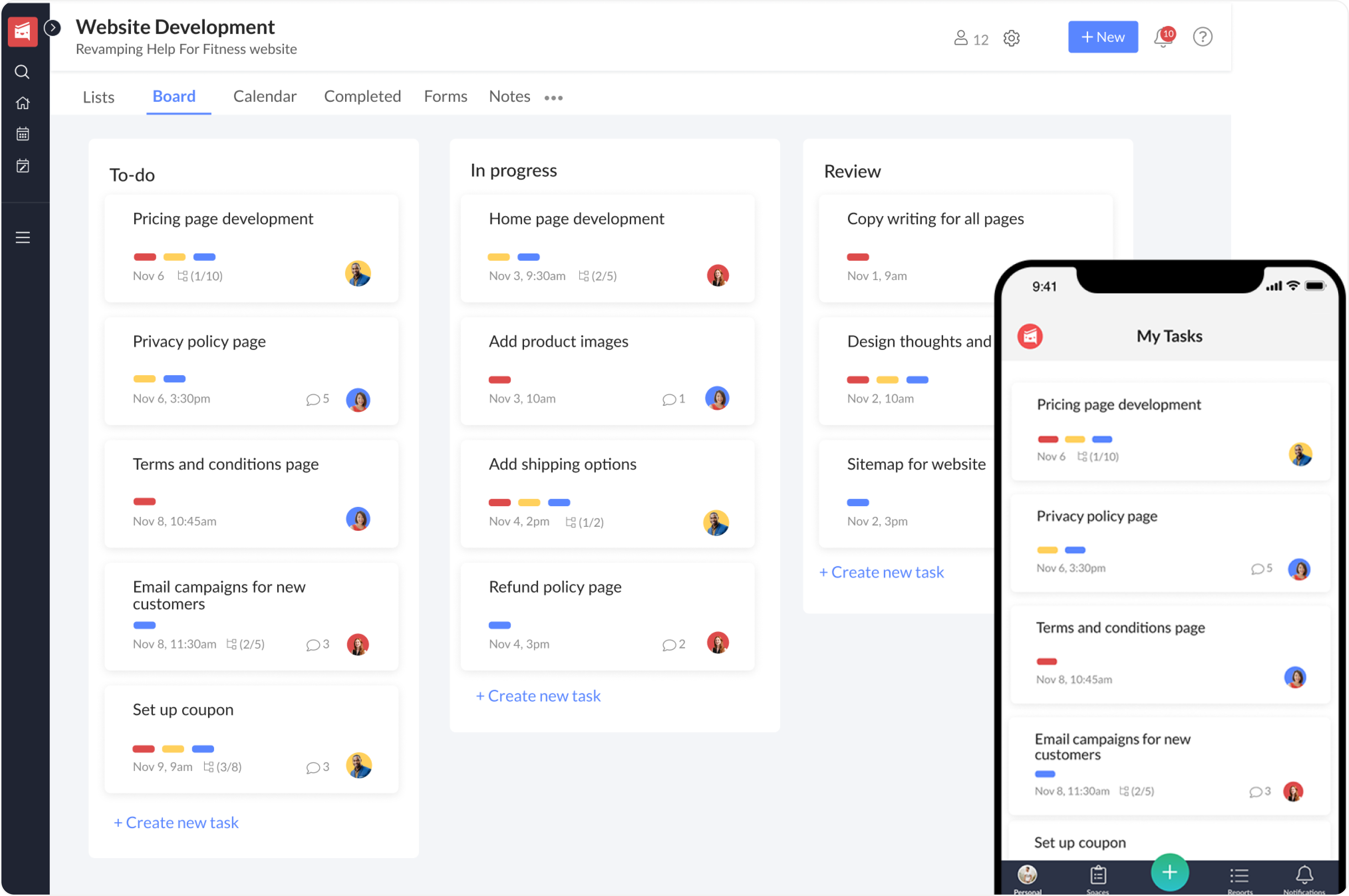
Workast's app screenshots include a hero image, board view, list view, calendar view, and timeline view. These screenshots showcase the various features and functionalities of the Workast platform and should be used consistently across all promotional materials.
